ebankIT
Brand Strategy & Web design
Digital banking with a human touch. Brand book and website redesign for a Portuguese fintech company that is connecting financial services with genuine, approachable customer experiences.
Services
- Brand strategy
- Brand guidelines
- Web design
- Illustration
- Project management
Year
- 2022
About the project
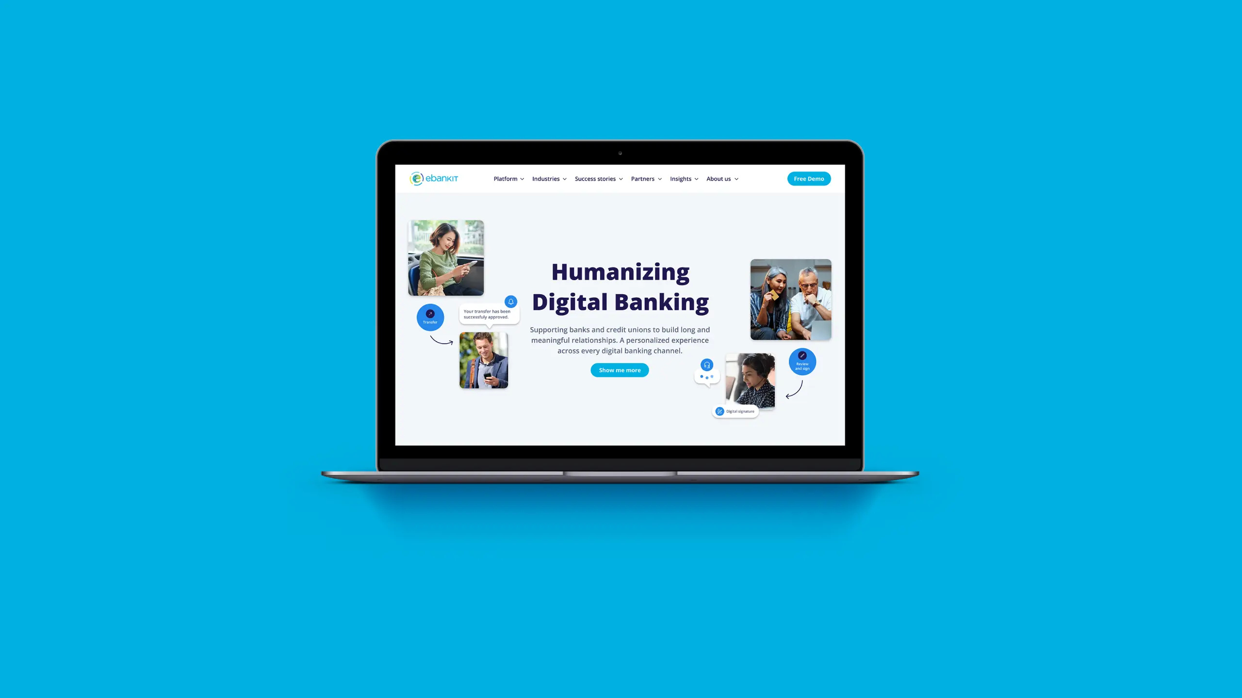
Established in 2014, ebankIT is a fintech company that since day one, has been working with banks and credit unions to deliver a digitally engaging banking experience to millions of users. Recently the company went through a rebranding process and has defined a new tagline. Humanizing digital banking is not only a reflection of the company's continuous commitment to elevate the user experience of their product but also of a strong belief that the future of banking technology should be more human, personalized and accessible.
The challenge proposed by ebankIt was to document their existing brand assets and establish usage guidelines, and redesign their company website in line with their new tagline and core values.


Solving the challenge
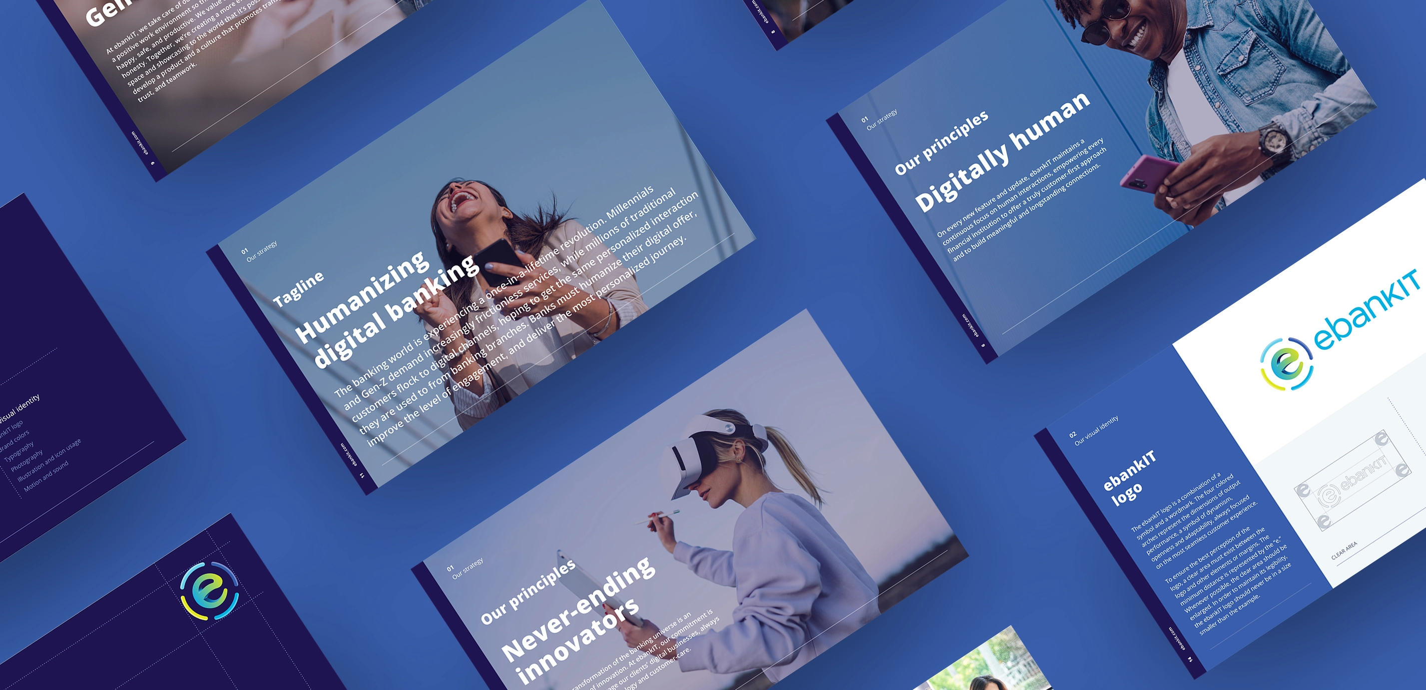
The first step was to develop a comprehensive brand book aimed at achieving two key objectives: clearly presenting ebankIT's core value proposition, principles, brand strategy, and tone of voice to ensure a shared understanding among collaborators of the brand's essence, and providing practical guidelines for consistently applying ebankIT’s visual identity across various mediums.
Working closely with the ebankIT team, we identified the core messages to feature in the brand book, creating a foundation that informed both strategic and practical design decisions.

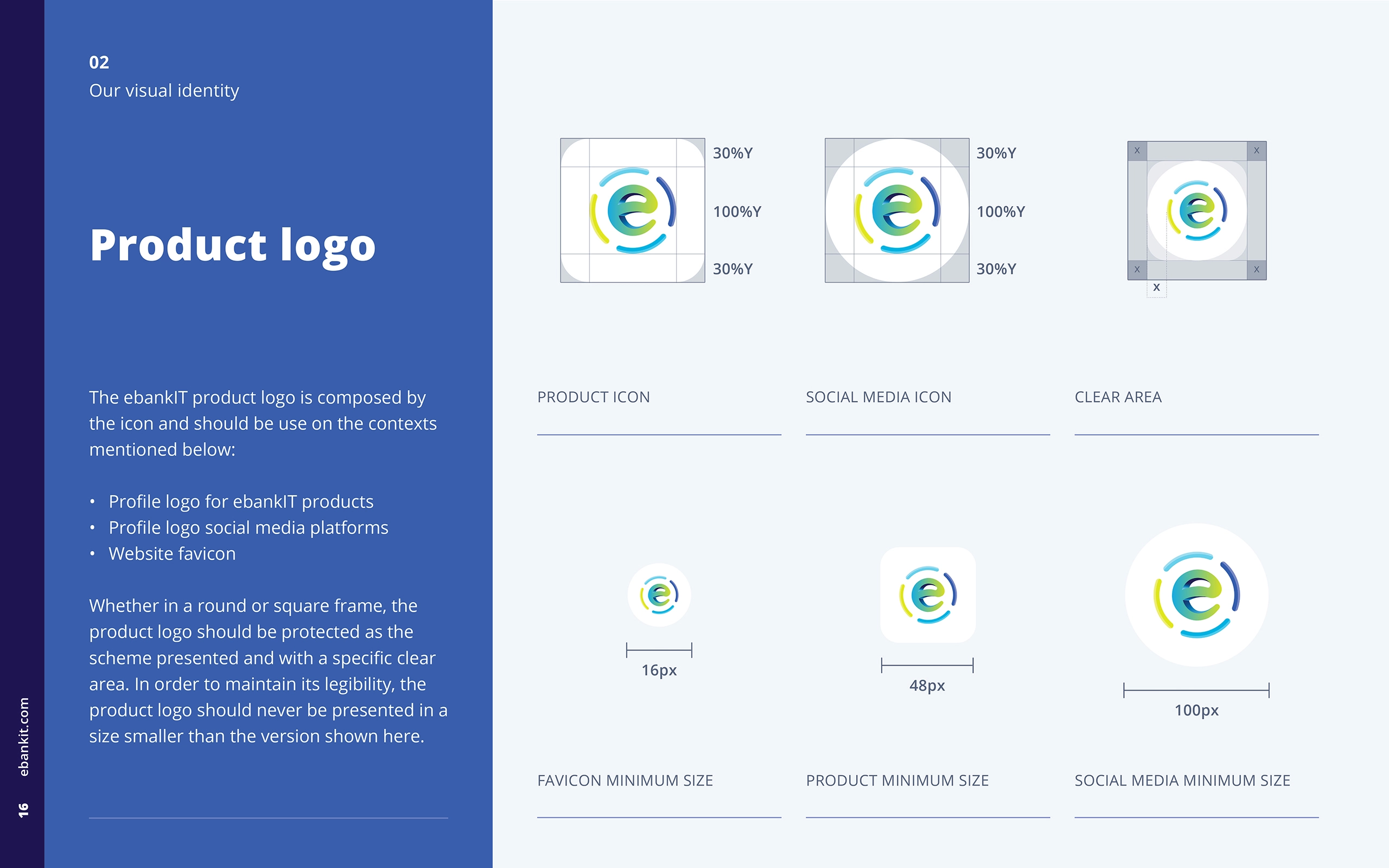
Next, we analyzed the existing brand assets to determine what was working, what was missing, and how to align them with the new brand direction. The established logo, available in horizontal and vertical compositions, and the existing typography served as starting points. We defined clear usage rules for the logo, such as minimum sizes for screen and print, safe zones, and one-color versions, while also illustrating what not to do—encouraging collaborators to channel creativity elsewhere.
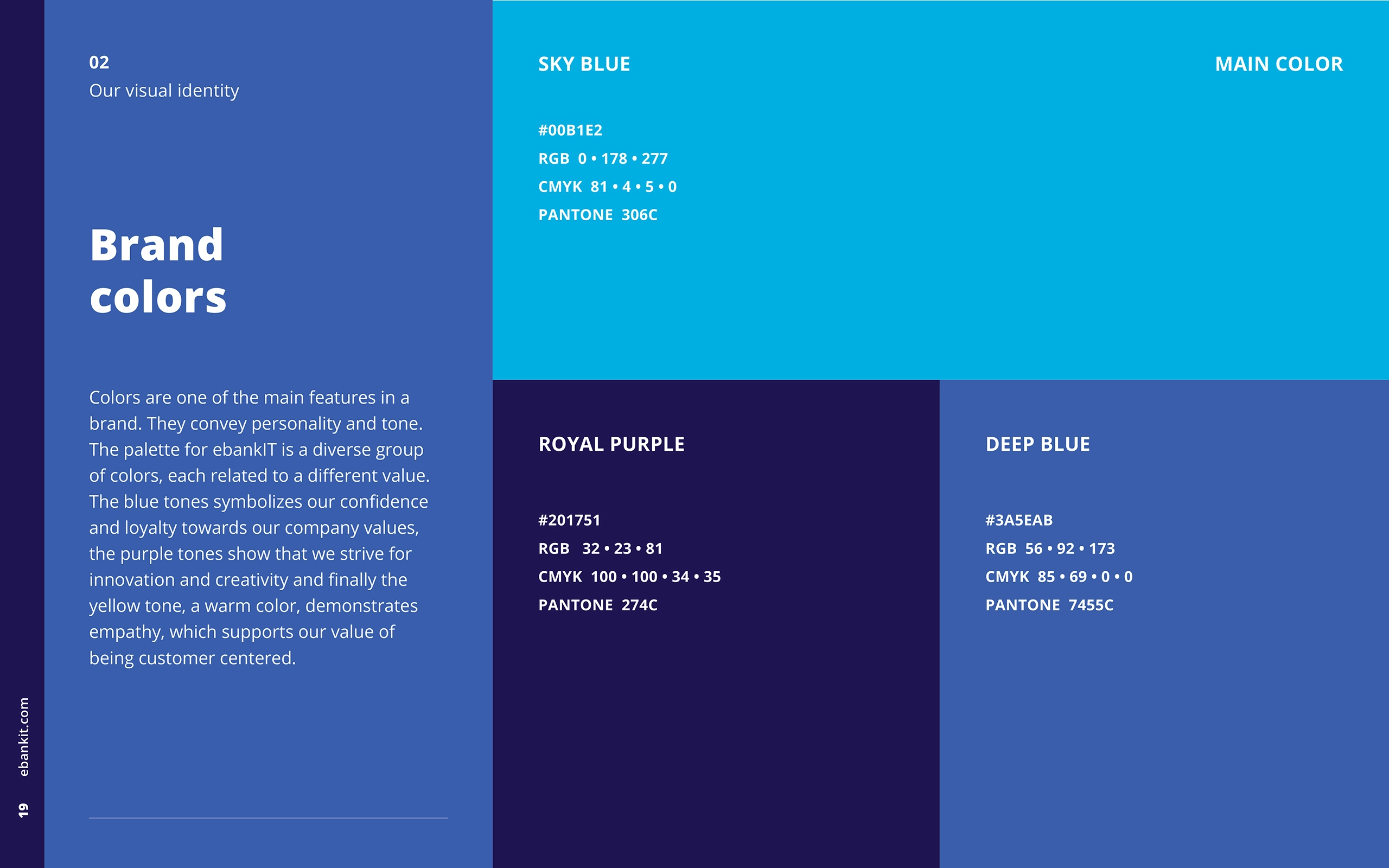
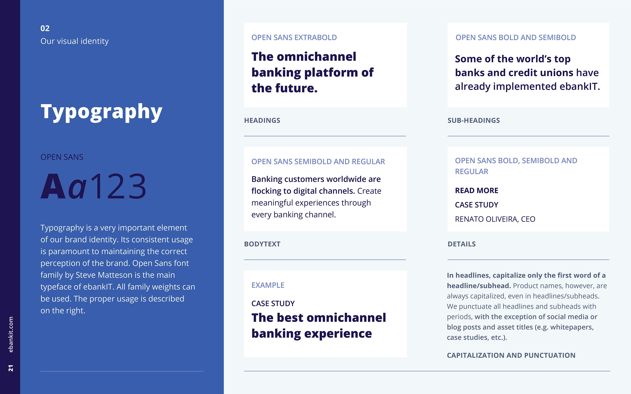
Logo colors and gradients were refined into a cohesive palette. We prioritized blues and purples to resonate with the brand's core values, designating primary and secondary color roles for flexibility and harmony. Typography guidelines were also established, specifying font styles, sizes, and spacing for headings, body text, and highlights, ensuring consistency and readability across all materials.
"The blue tones symbolizes our confidence and loyalty towards our company values..."
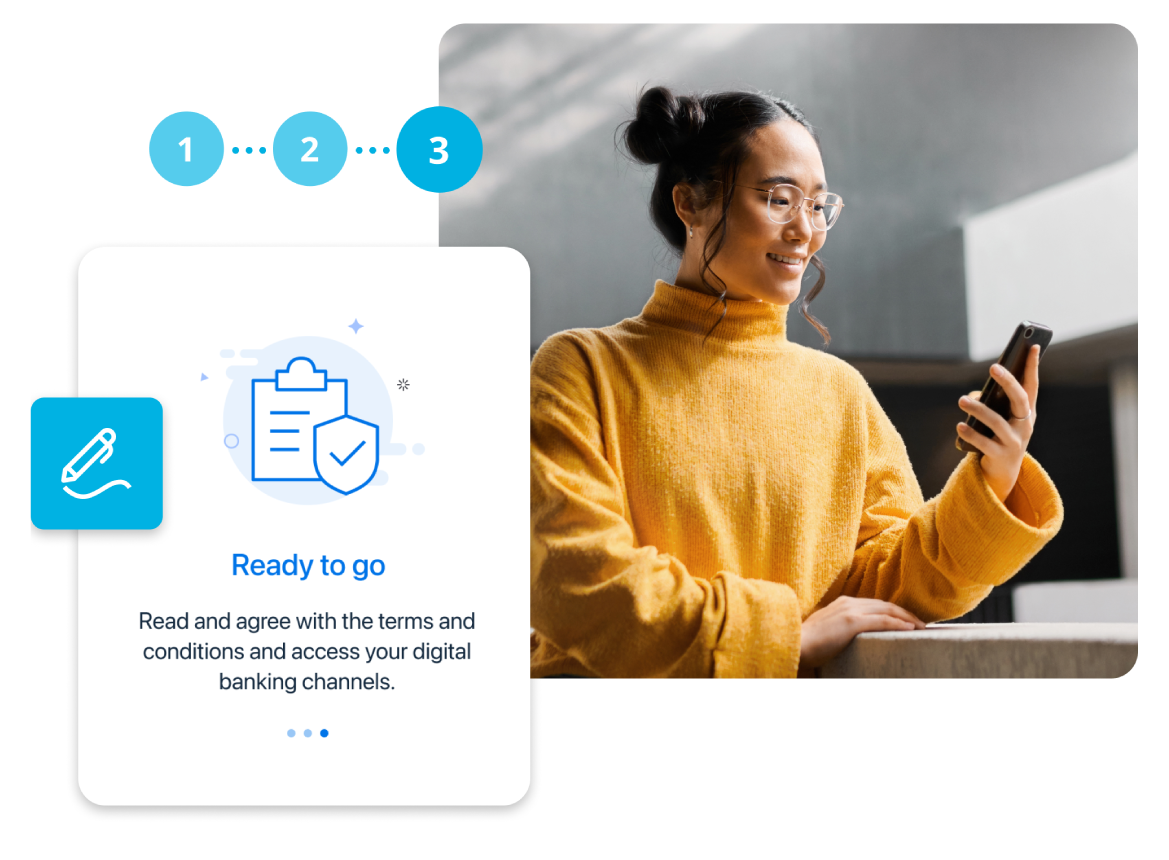
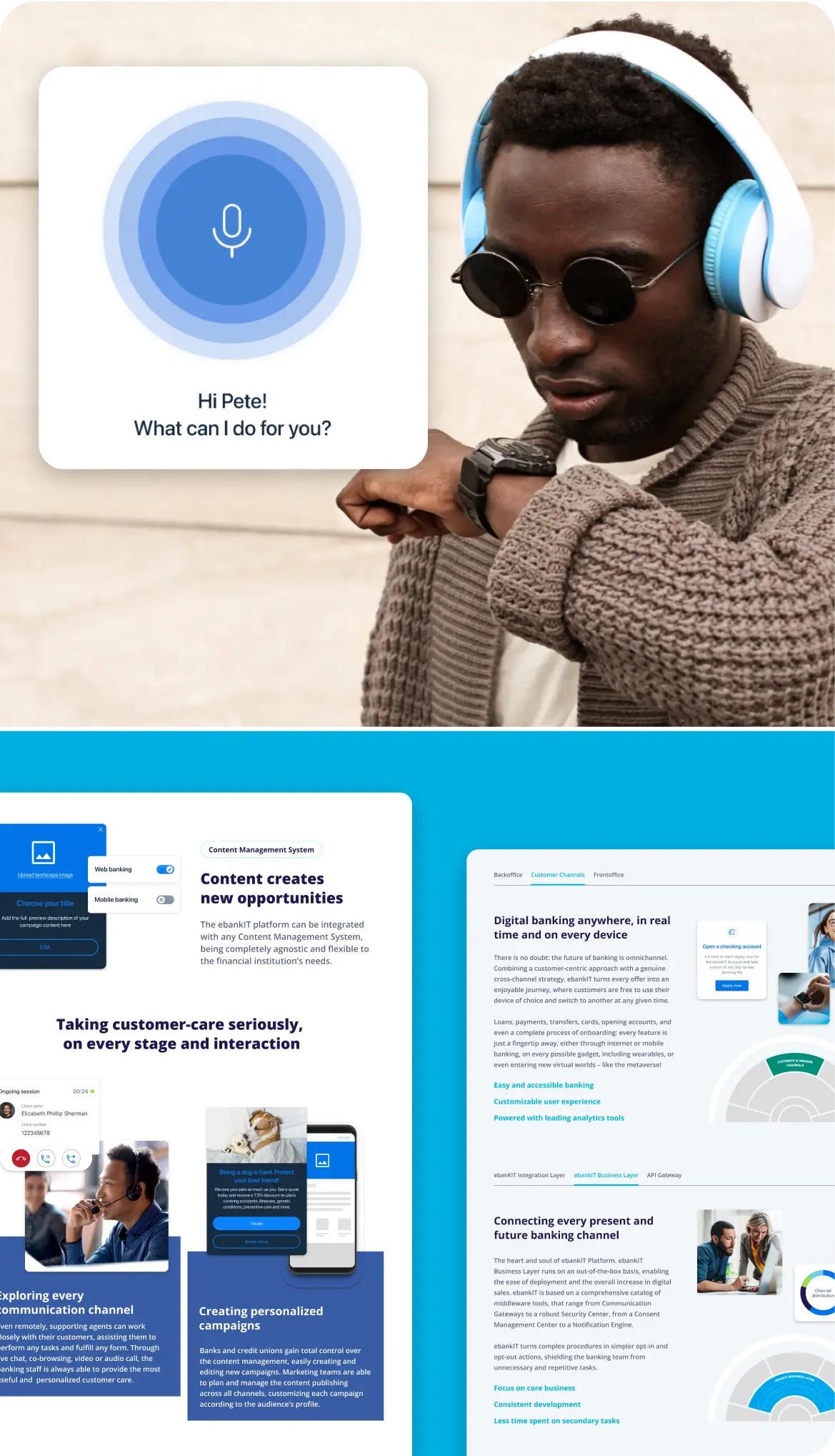
Photography rules were introduced to align with the tagline "Humanizing digital banking." Images were chosen to emphasize people interacting with digital devices, favoring light backgrounds, pops of color, and a chromatic language consistent with the brand’s visual tone.
To expand the brand’s toolkit, a custom set of illustrations and icons was created. The illustration style featured clean, outlined graphics with rounded forms to convey approachability and playfulness, balanced with solid, structured shapes for visual contrast. These elements provided versatility while maintaining brand coherence.

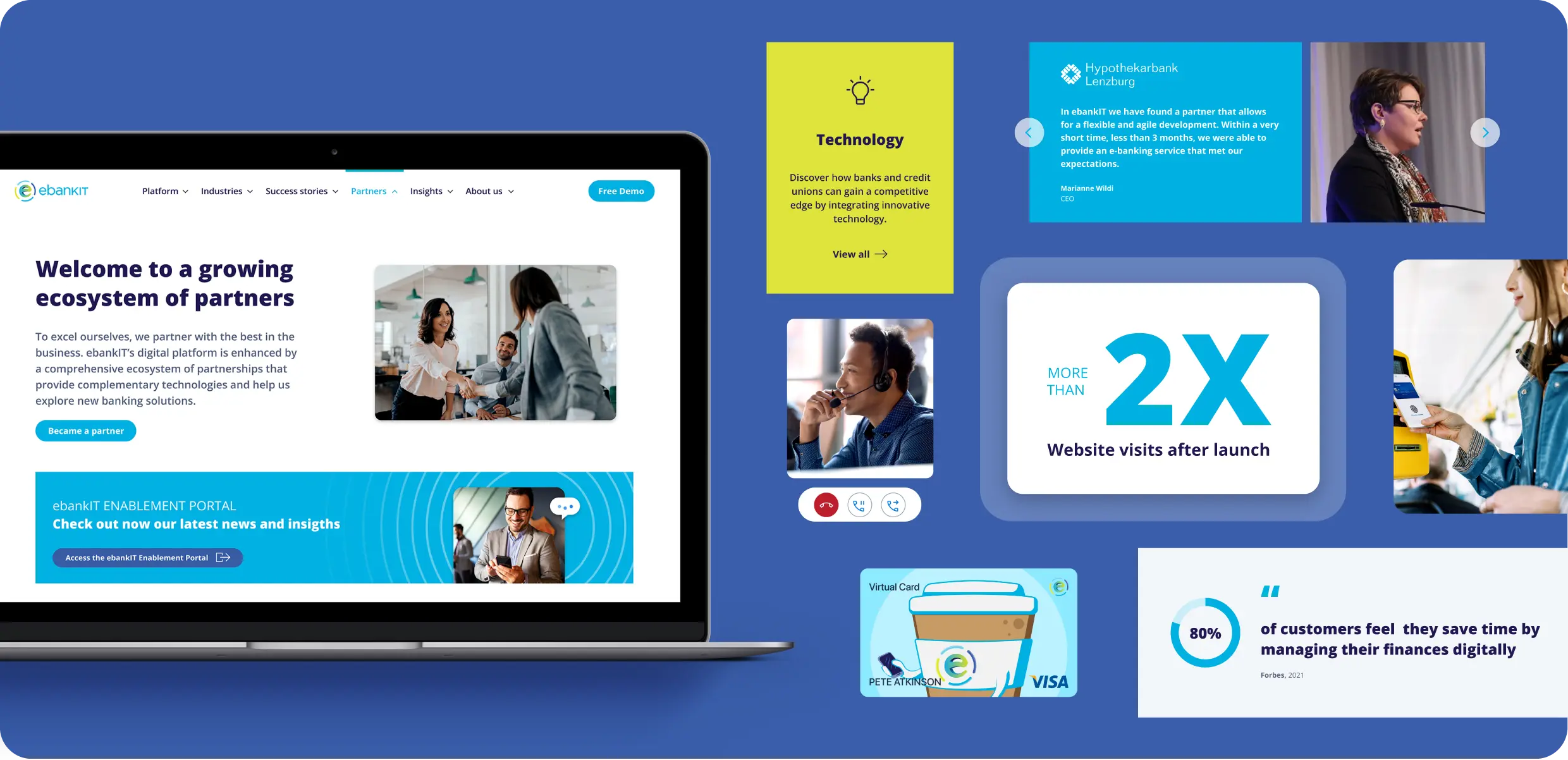
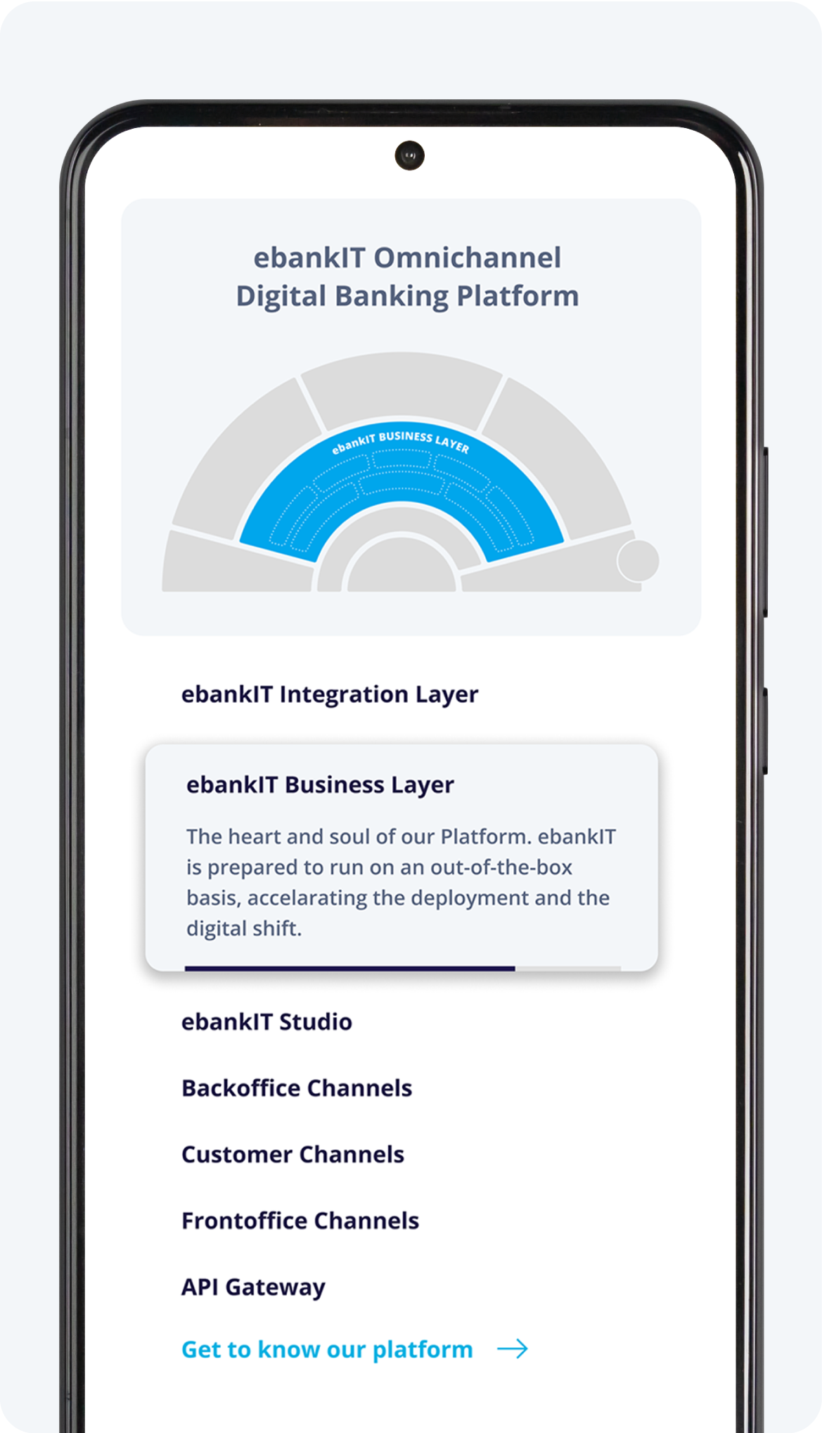
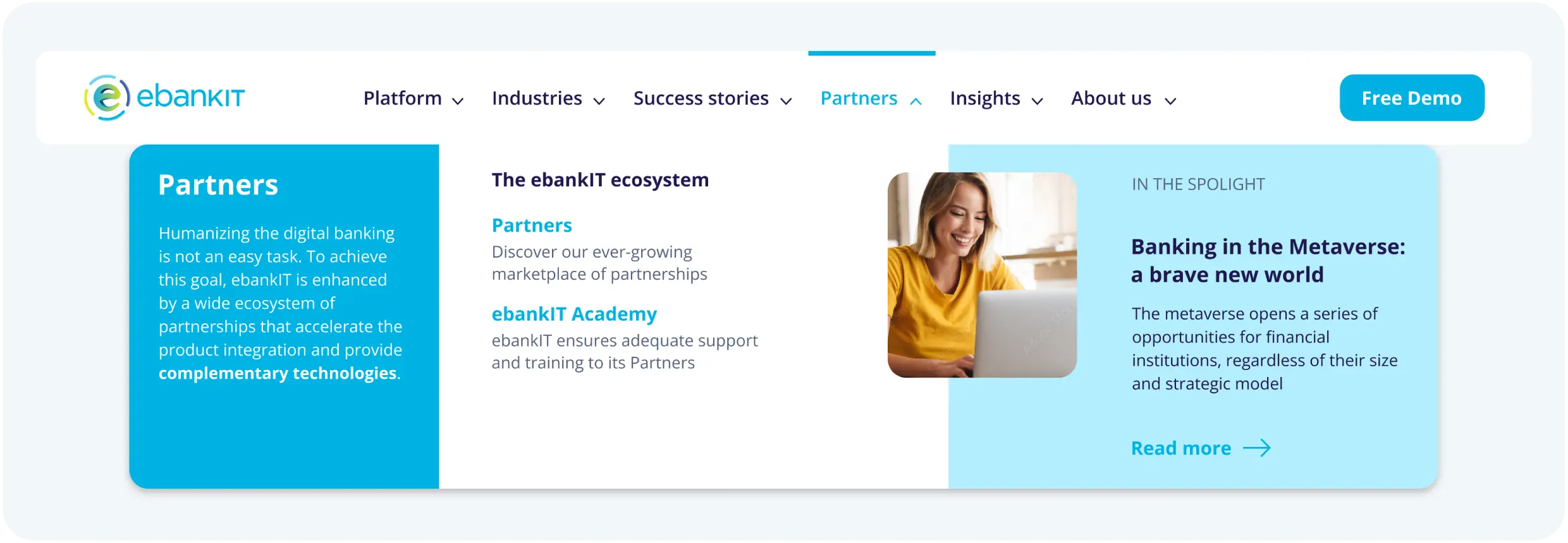
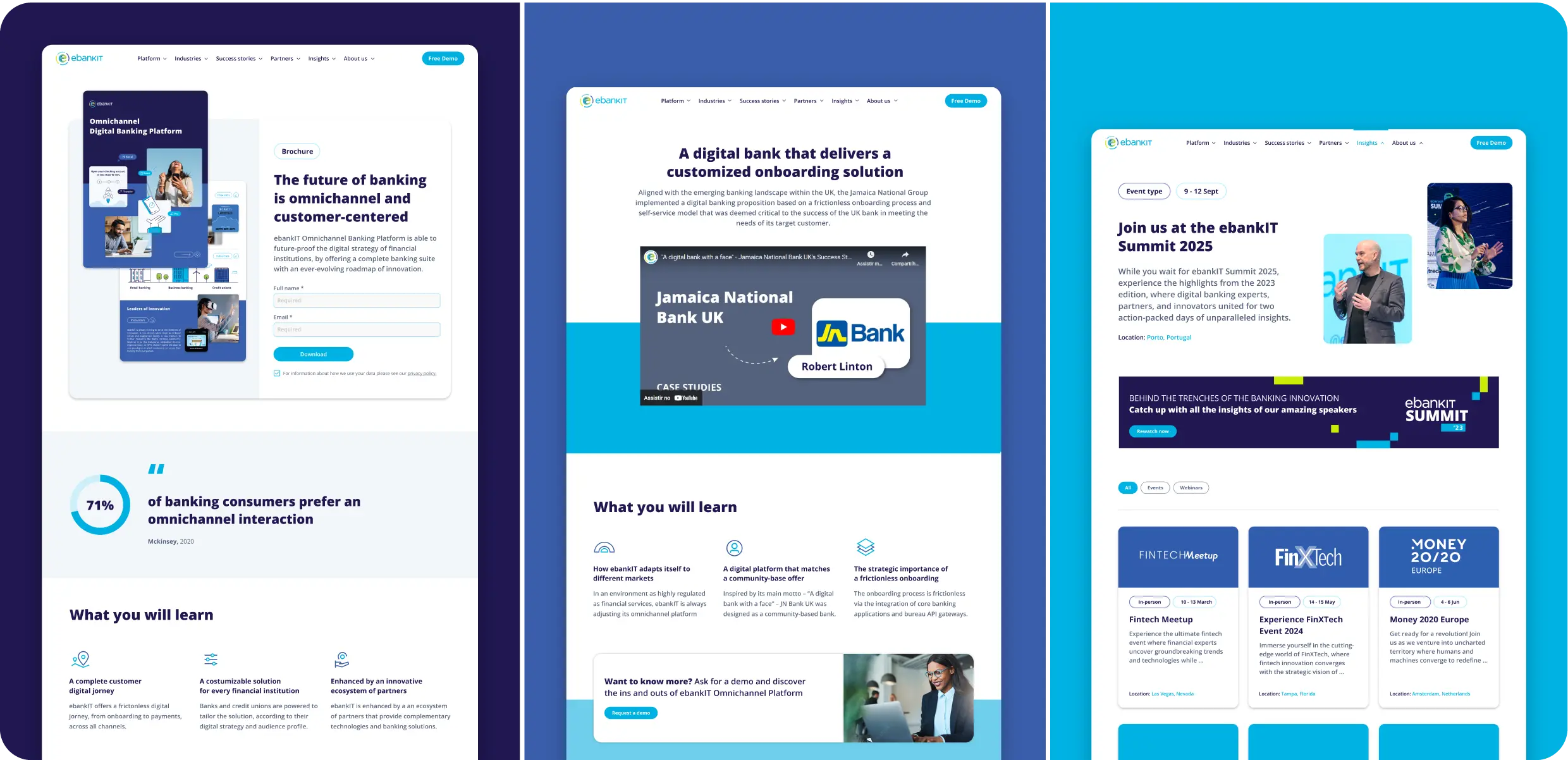
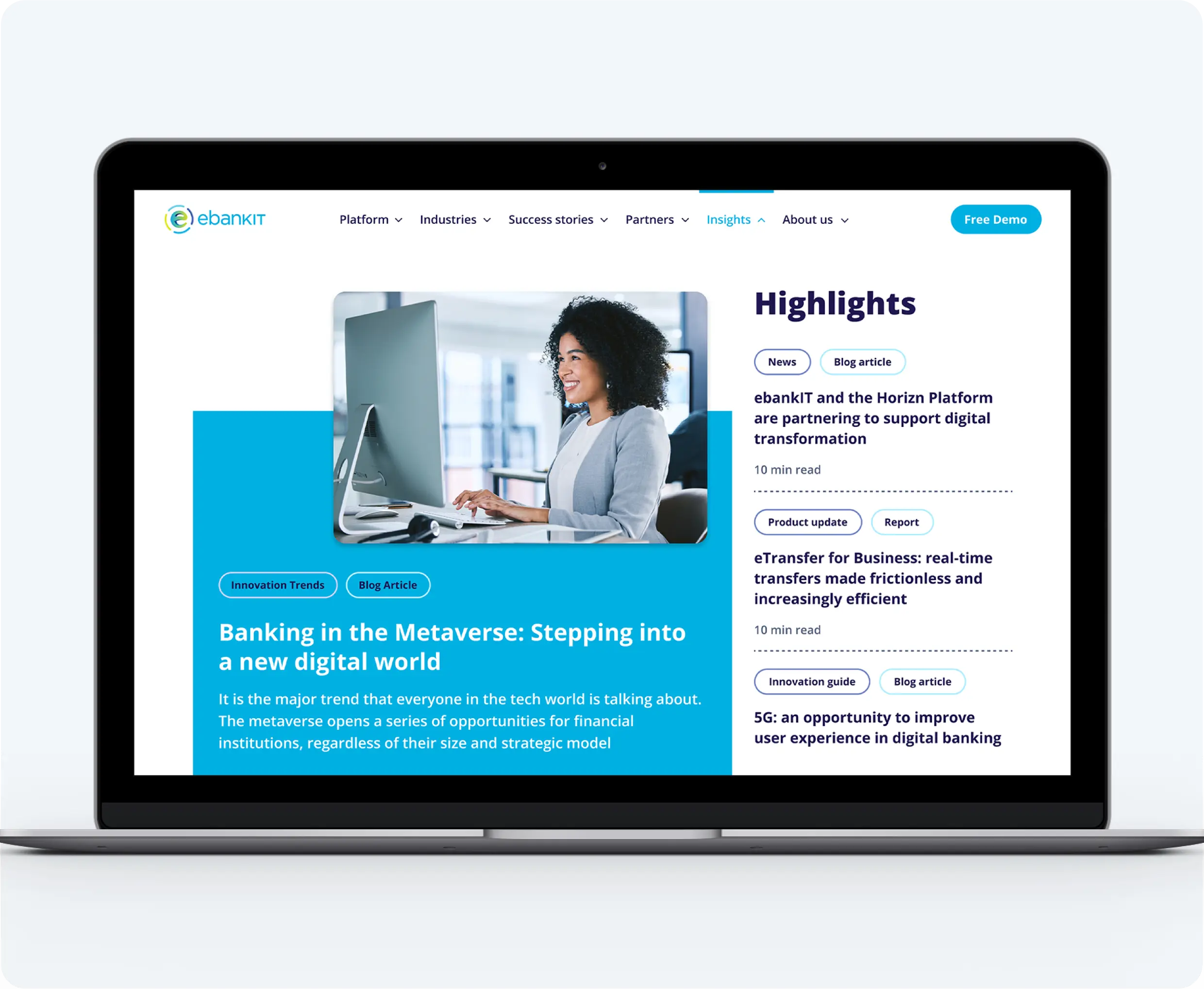
The web design Process
The website was a key example of how ebankIT's values and brand guidelines were applied. Rather than beginning with a traditional sitemap, the structure was collaboratively defined with the marketing team through the main menu and submenu components, simplifying visualization and alignment.
Each page was then structured through brainstorming sessions to determine the best approaches for visual and textual content. References from competitor and industry websites were explored to create a visually appealing, conversion-focused design that supported lead generation. The design also addressed future needs, such as landing pages and campaign-specific modules. A central challenge was presenting the complex information about ebankIT’s platform and solutions clearly, focusing on B2B pain points and the tailored solutions ebankIT offers to banks and credit unions.
Low-fidelity wireframes were created based on the copywriter's content and refined through team collaboration until high-fidelity prototypes were finalized. All design decisions aligned with the brand book to ensure consistency with ebankIT's identity.
The website was developed by an external team using HubSpot, which, despite some personalization limitations, allowed the marketing team to easily update and manage content. Detailed annotations were provided with the wireframes to streamline the development process and ensure efficiency.
The Value
Establishing clear brand guidelines for ebankIT, alongside a new illustration and icon set, has significantly improved how the company communicates its core values. The new approach ensures that all teams and external materials now speak a consistent, cohesive brand language.
The new website has been a standout success, more than doubling visitor numbers in just six months. Moreover, the marketing team now enjoys greater autonomy, able to edit and add content quickly without constant designer involvement.